Flow’s Kitchen: Cooking up Open Source Visualization for ATFM Research

For the past year or so, I’ve been quietly stirring a pot on the back burner: an experiment that began with scraps and leftovers, and slowly turned into something nourishing. What I wished for most when I first stepped into Air Traffic Flow Management (ATFM) research was a kitchen stocked with the right utensils. Today, I’m excited (and a little humbled) to invite you in: Flow’s Kitchen - an open-source data visualization application made especially for ATFM research.
Why “Kitchen”? Because research feels a lot like cooking. You collect ingredients: data, models, and assumptions. You chop, mix, and season them, hoping they come together into a dish worth serving. Sometimes the stew simmers into something rich and clear. Sometimes it boils over. Flow’s Kitchen is my way of setting the table with tools that make the recipe more dependable, while still leaving room for creativity and taste.
Why visualization is the first ingredient
Anyone who has tried to cook without seeing what’s in the pan knows the feeling: you’re guessing at smells and sounds, but without vision, you’re in the dark. ATFM research is the same. Flight lists, capacity matrices, optimization outputs. They’re like raw ingredients locked in opaque jars. At some point, you need to lift the lid and see them.
Visualization is not garnish; it’s the flame under the pot. Decades of research remind us of this: diagrams restructure problem solving (Larkin & Simon, 1987), thoughtful visual encodings sharpen perception (Cleveland & McGill, 1984), interactive views invite tasting and adjusting on the fly (Heer & Shneiderman, 2012), and in dynamic systems, systems decision quality depends on awareness of what’s actually happening (Endsley, 1995). Without adequate visuals, we risk bland results, undercooked assumptions, and brittle conclusions.
I’ve felt it myself: hours lost chewing on a “mysterious” optimization output that only revealed its secret once I plotted it on a map. Suddenly the problem wasn’t the recipe at all: it was a spoiled ingredient upstream. With 40% of our brain’s neurons devoted to vision, skipping visualization feels like trying to cook blindfolded.
When Python’s geo stack falls short
At first, I reached for the trusted pantry staples: GeoPandas for chopping geometry, Folium for quick plating, Cartopy for elegant static spreads. These are remarkable tools, each crafted by passionate communities. But when faced with the demands of ATFM, I found myself burning pans and overflowing pots:
- GeoPandas slows to a crawl on giant trajectory datasets.
- Folium looks appetizing until you sprinkle too many points, then the browser chokes on the garnish.
- Cartopy serves exquisite maps, but they’re frozen dishes: beautiful, yet immovable when you need live flavor.
None of these were built to handle the rolling boil of time-varying constraints, millions of trajectories, or operator-style tasting. What ATFM needs is not just another map, but a whole new stove.
Verify before optimize
ATFM research is a recipe with many steps: cleaning data, simmering demand/capacity models, stirring in optimizations, and plating simulations. Burn one step, and the final dish is ruined.
Flow’s Kitchen insists on tasting at every stage. You don’t just dump ingredients in and hope for a feast; you pulse and fold. You sample, adjust, and check balance along the way, such as salinity, heat, timing. Each intermediate step is revealed, each assumption surfaced, with provenance labeled on the jar. Like a chef tasting broth before adding spices, this ensures the final result is not just edible, but balanced and sound: traceable, reproducible, and worthy of serving. If something’s off, you fix it upstream rather than masking it. Such tools will illuminate the path you traverse, the faulty assumptions you made, and providing impeccable insights that only visualization and analysis could bring. In other words, Flow's Kitchen attempt to make your dish... right.
Don’t forget the humans
Of course, even the most technically perfect dish fails if the diners can’t stomach it. ATFM is no different. Controllers and operators work in high-pressure kitchens of their own, where attention, awareness, and mental load determine outcomes. Designing tools without reflecting their reality is like serving haute cuisine to someone who just needed a hearty soup.
Too often, research takes the safer path: reheating old recipes, recycling old code. That’s fine, but it rarely questions the menu itself. Flow’s Kitchen aims to let researchers, whether independent cooks or small-lab brigades, experiment with new flavors, and plate them in a way that feels familiar to the people actually eating, without having to spend a fortune on commercial-grade software that are only developed for the professionals.
Big institutions may have Michelin-starred kitchens, with access to ingredients and tools most of us can only dream of. Flow’s Kitchen won’t erase that gap, but it can hand smaller teams a reliable set of utensils and standard workflows. Whether you’re a PhD student seasoning your first dataset, an independent researcher stirring up bold new ideas, or just curious how ATFM smells and tastes in practice, this kitchen is open to you.
Access
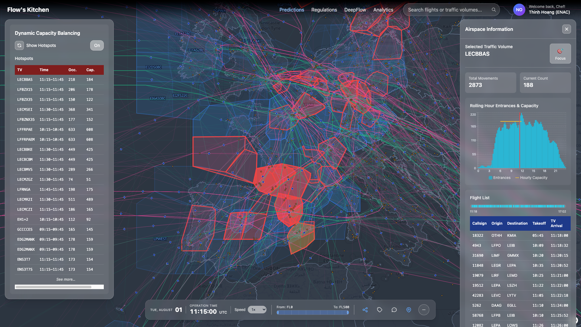
The first alpha version is already simmering on the stove and can be tasted freely at https://quasar.intuelle.com. In the coming weeks, we’ll be adding more ingredients: scaling up the infrastructure, weaving in weather data, and experimenting with route prediction. Until then, don’t be surprised if you encounter the occasional rainy-day outage or a quirky UI mishap.
More thorough documentation is in the works and will be served in our upcoming publications, along with example recipes you can try straight away.
As always, your feedback is always welcomed. Feel free to drop me an email at dthoang@intuelle.com for the improvements you wish to see.
Currently, the flight data is provided by the OpenSky Network, while the capacity data is a mock-up derived from maximum demand. The definitions of sectors and traffic volumes are obtained through manual parsing of public EUROCONTROL maps.
In the weeks ahead, I also plan to write more about my experience tackling such a challenging problem. It will be a personal account: the stories I witnessed, the lessons and struggles I carried through, and how it feels to begin research in this field from absolute zero. My hope is that these reflections will encourage others who are just starting out to see that the path, though steep, is worth climbing.